In a highly competitive market, the design and printing of a can label are crucial for brand communication. A distinctive and professional can design can attract consumers, enhance brand image, and increase market competitiveness. This article will delve into how to design a high-quality can label, covering every detail from concept to completion.
1. Thorough Understanding of Printing Techniques and Material Science
Before starting the design process, it is essential to have a comprehensive understanding of can printing techniques and material science. Common printing methods include gravure printing, offset printing, and screen printing, each of which has a significant impact on color accuracy and pattern detail presentation.
Key Points:
Gravure Printing: Suitable for high-volume production, it offers a wide color gamut and high color saturation but has a higher initial setup cost.
Offset Printing: Suitable for medium-volume production, it can present fine images and text details with high color fidelity.
Screen Printing: Used for small-volume production and special effects (such as metallic sheen and embossing), it is ideal for unique design requirements.
2. Determine Precise Design Dimensions and Professional Templates
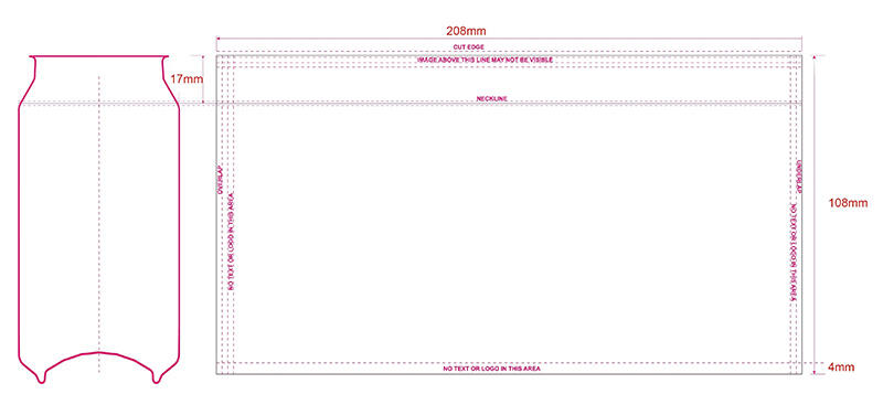
Design needs to be based on accurate dimensions and templates. FRIEND usually provide standard template files that include important information such as the flat layout, safe zone, and folding areas. These parameters ensure that design elements are not cut off or misaligned during the actual printing process.

Key Points:
Flat Layout: Provides an accurate flat layout of the can to ensure precise alignment of design elements.
Safe Zone: Specifies the safe range for important design elements to avoid being cut off.
Folding Areas: Indicates folding and seam positions, avoiding placing critical design elements in these areas.
3. Design Sophisticated Visual Elements
The refinement of visual elements is crucial during the design process. Ensure that the choice of colors, patterns, textures, and fonts aligns with the brand image and product characteristics.
Color Selection:
Use brand standard colors to ensure visual consistency.
Adopt the CMYK color model to ensure accurate print colors.
Patterns and Textures:
Design unique patterns and textures based on product positioning, ensuring high resolution (at least 300dpi).
Consider the impact of material and printing techniques on pattern performance, such as the reflective effect on metallic cans.
Font Selection:
Choose fonts that fit the brand image and are easy to read, ensuring appropriate font size and spacing.
Use high-contrast color schemes to ensure good readability under different lighting conditions.
4. Integrate Brand Identity and Regulatory Information
Can design should be not only aesthetically pleasing but also convey brand information clearly and comply with regulations. The layout of brand logos, product names, ingredients, and other critical information should be reasonable and meet regulatory requirements.
Key Points:
Brand Logo: Place in an easily recognizable position to ensure high brand visibility.
Product Name: Highlight the product name to ensure consumers can see it at a glance.
Ingredients and Nutritional Information: Follow regulatory requirements to ensure complete and clear information.
Barcode and Legal Information: Place in the specified location to comply with international and regional regulations.
5. Conduct Rigorous Proofing and Precise Revisions
After completing the design, rigorous proofing is crucial to ensure the final print quality. Proofing can help identify and correct potential issues in the design, such as color deviations and blurred patterns.
Key Points:
Color Calibration: Ensure that the proof color matches the final print color closely, using professional color management tools.
Detail Check: Thoroughly check all visual elements and text content to ensure no spelling errors or image distortion.
Adjustment and Revision: Make precise revisions based on the proof results to ensure the best state for every detail of the design.
6. Submit Print-Ready Files That Meet Professional Standards
After proofing and revisions, submit the final print-ready files according to the printing company's requirements. Ensure that file format, resolution, and output settings meet professional standards.
Key Points:
File Format: Use professional vector formats (such as PDF, AI, EPS) to ensure clear and jagged-free pattern edges.
Resolution: At least 300dpi to ensure high-resolution output of patterns and text.
File Check: Use professional software for pre-flight checks to ensure no spelling errors or visual flaws.
Designing a high-quality can label is a complex and meticulous task involving knowledge and skills from multiple professional fields. From understanding printing techniques in depth, determining precise design dimensions, refining visual elements, integrating brand and regulatory information, to rigorous proofing and submitting professional files, each step is crucial. FRIEND can provide you with the most professional color management solutions to provide comprehensive support for your design work. We will help you create outstanding can packaging that enhances brand competitiveness.
 Hot News
2024-02-29
2024-09-29
2024-09-13
2024-08-27
2024-08-14
2024-08-07